Tutorial
1.How to run a basic job
2.Input details
1.Email address
2.Input options
1.Select phenotype(s)
2.Select phenotype(s) associated genes
3.Select genes
4.Select term(s)
5.Select term(s) associated genes
3.Available databases
4.Upload database(s)
1.Upload database(s)
2.Preparing input data
5.Model validation
6.Enrichment analysis
3.Retrieve a job
4.Results page
1.Job summary
2.Model performance
3.Results table
1.Pie charts
4.Enrichment analysis
5.Gene networks
6.Machine learning pipeline
7.Download results
5.Results files
6.Browser compatibility
7.External resources
8.References
9.Extras
1.Using results from sequencing studies in DGLinker
2.Using the DGLinker output for variant filtering
1.How to run a basic job
To run a job please follow the steps below (Figure 1):
1. Go to the homepage (https://dglinker.rosalind.kcl.ac.uk);
2. (Optional but recommended) Enter your email address if you want to receive job notifications and details, and a link to the results page via email;
3. Choose an input option and provide the input accordingly;
4. Alternatively, load the example;
5. Click “Predict”.
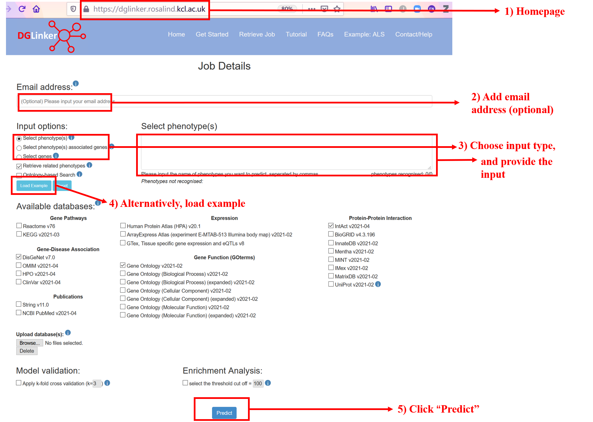
Figure 1
2.Input details
For brief field descriptions, you can use the info messages (i) (Figure 2).

Figure 2
2.1 Email address
Providing an email address is optional although strongly recommended (Figure 1). If provided, the webserver will send the following: 1) a confirmation email when the job is submitted, with the job ID and a link to the results page, and 2) a completion email to alert the user that either the results are now available or, in case of error, that the job was not completed successfully.
2.2 Input options
2.2.1 Select phenotype(s)
This is the default input option (Figure 3). DGLinker uses our current knowledge of the genes that are associated with the target phenotype to predict new candidate genes. When one or more phenotypes are selected, DGLinker uses all genes associated with them on selected disease-gene association database(s) as input genes.
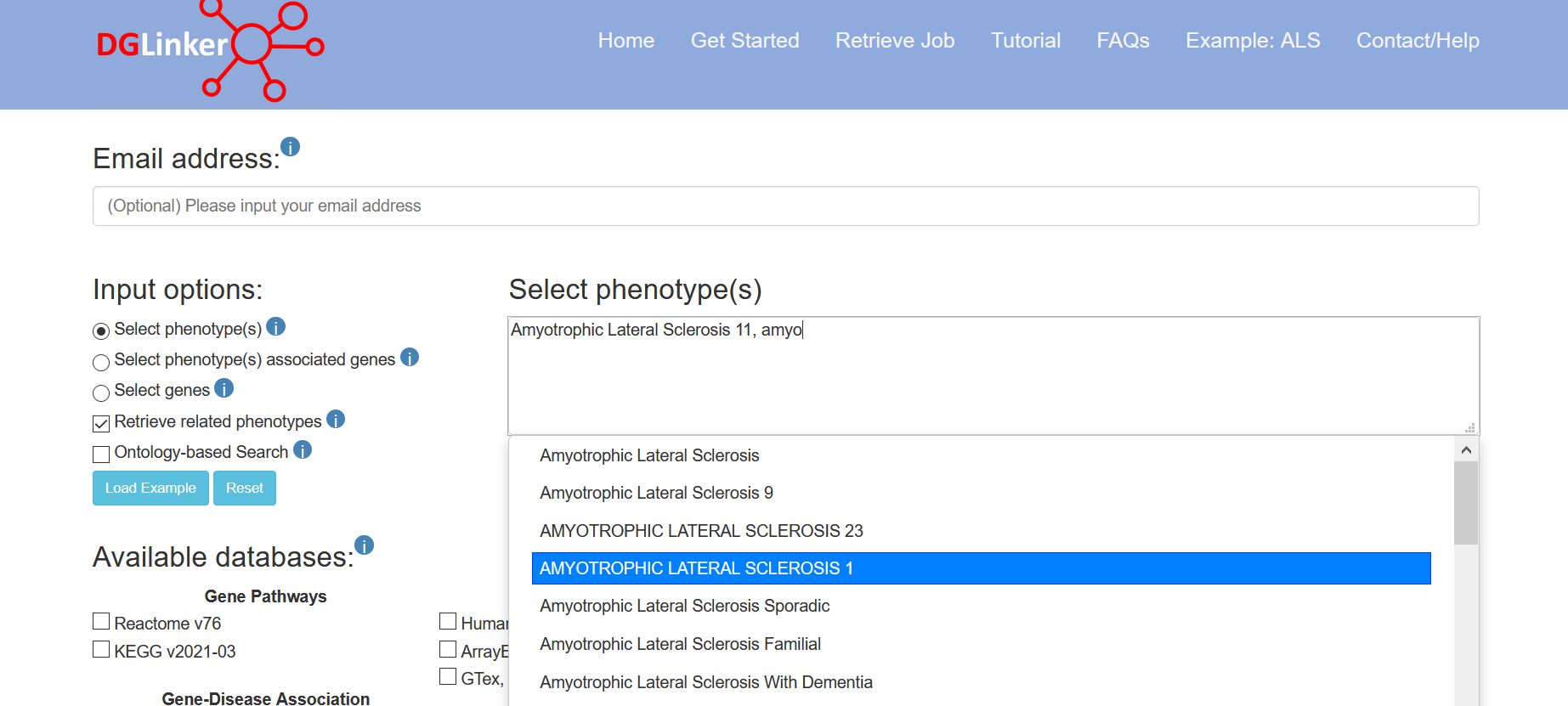
Figure 3
If “Retrieve related phenotypes” is selected, phenotypes matching the input ones will be automatically selected (Figure 4).
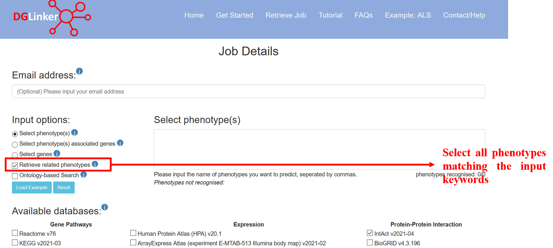
Figure 4
2.2.2 Select phenotype(s) associated genes
If the user selects this option, they must provide both a list of genes and one or more phenotypes that the genes (HGNC symbols) are associated with (Figure 5). These will be used to train the predictive model instead of the selected disease-gene associations. Although our provided databases are comprehensive and curated databases of gene-phenotype relationships, it is not unusual for researchers to have their own manually curated lists of phenotype-associated genes. These might reflect, for example, specific required supporting evidence of association, novel/not-yet established associations, the result of their own studies, or disease subtypes.
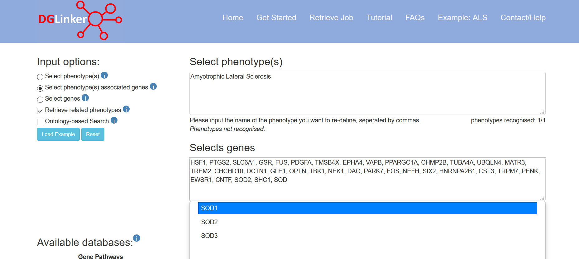
Figure 5
2.2.3 Select genes
This option allows the user to provide a set of genes (HGNC symbols) without selecting a specific phenotype (Figure 6). This is suitable for studying phenotypes that are not present in the DGLinker database. We recommend the users to search for the target phenotype using option 1 or 2 before using this option to make sure that the target phenotype is not present in the server database. Where this option is used, it is not a requirement that the associated phenotype is necessarily a disease, for example, a user could specify genes linked to a specific biological pathway or drug response.
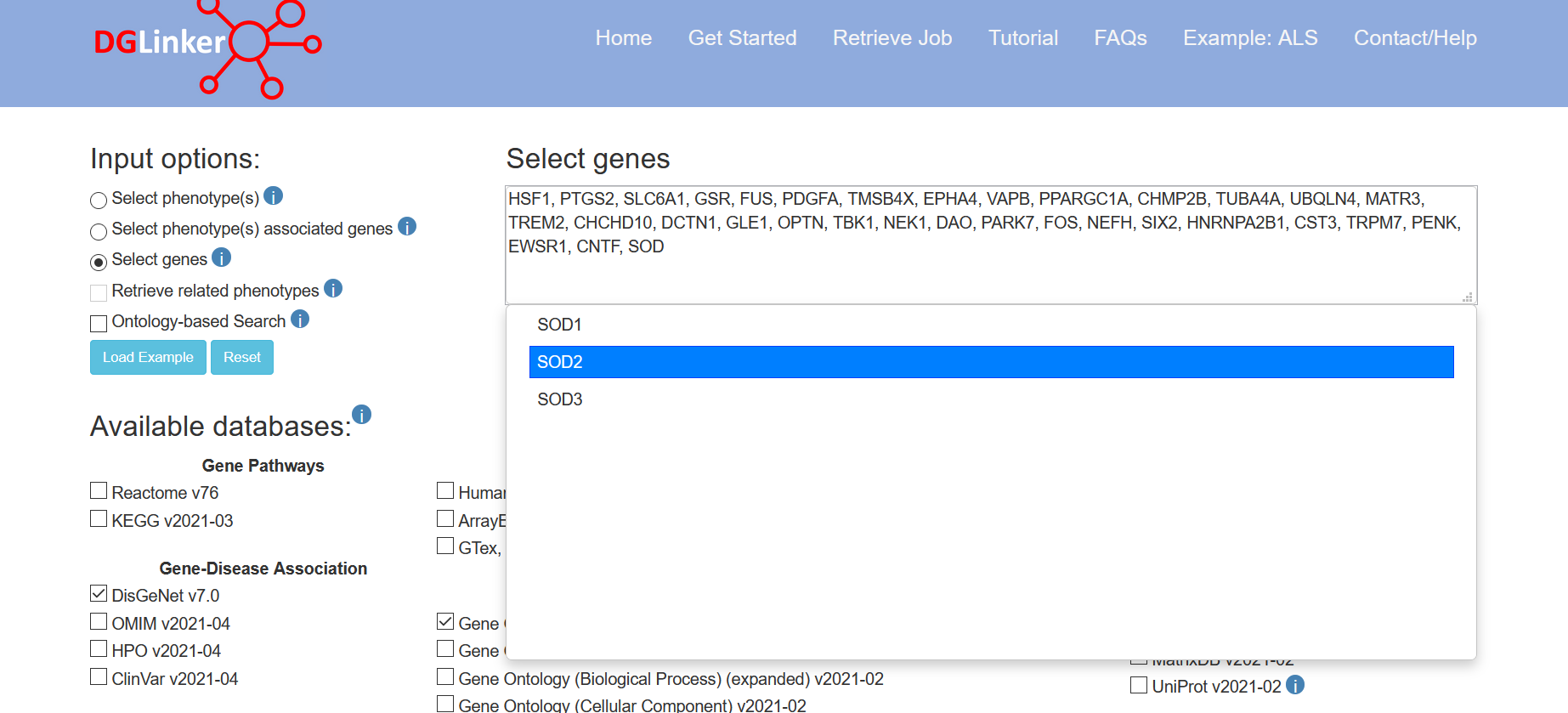
Figure 6
2.2.4 Select term(s)
Select term(s) and Select term(s) associated genes will show if 'ontology-based search' option is selected (Figure 7).
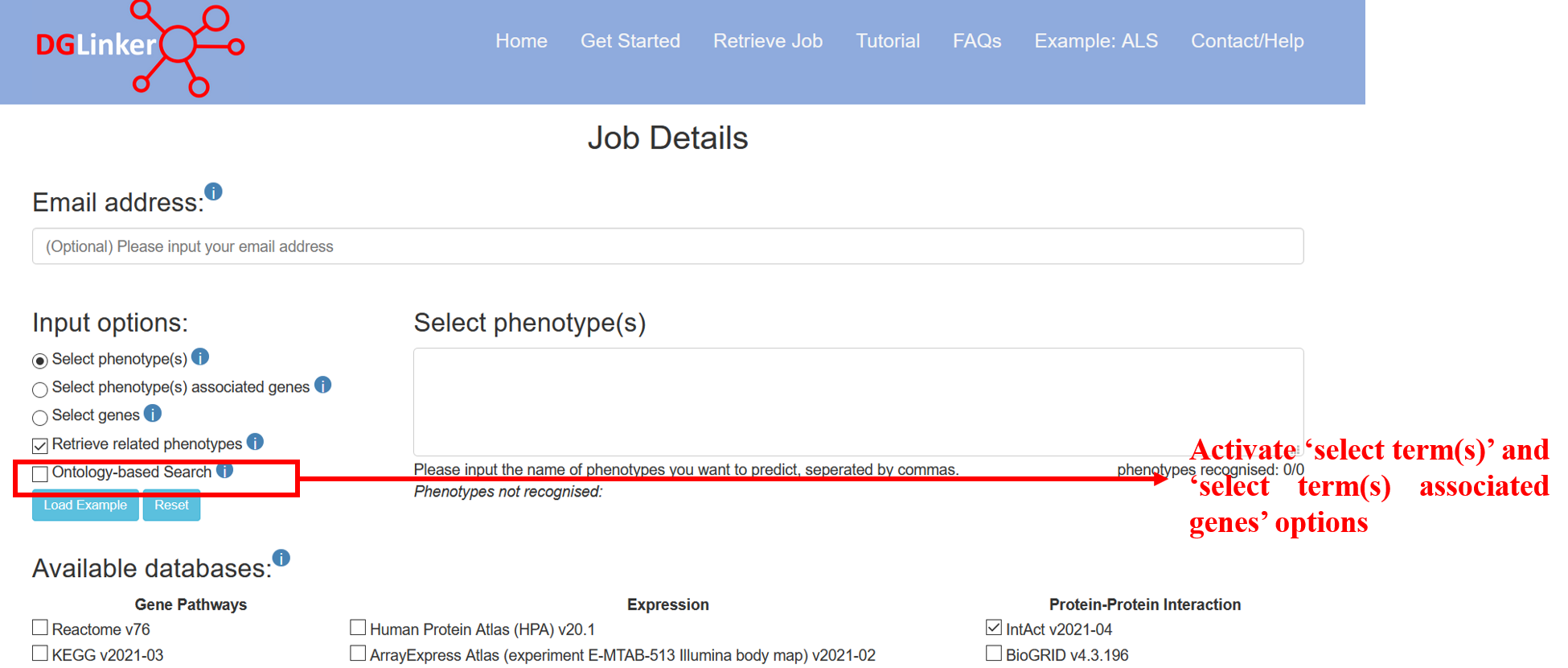
Figure 7
The select term(s) option allows the user to choose HPO terms and the server will automatically include all descendant items of the ontology. DGLinker uses genes that are associated with these terms to predict new candidate genes. The genes associated with input terms are from disease-gene association databases selected.
2.2.5 Select term(s) associated genes
If the user selects this option, they must provide both a list of genes and one or more terms that the genes (HGNC symbols) are associated with (Figure 8). These will be used to train the predictive model instead of the associations in selected disease-gene association databases.
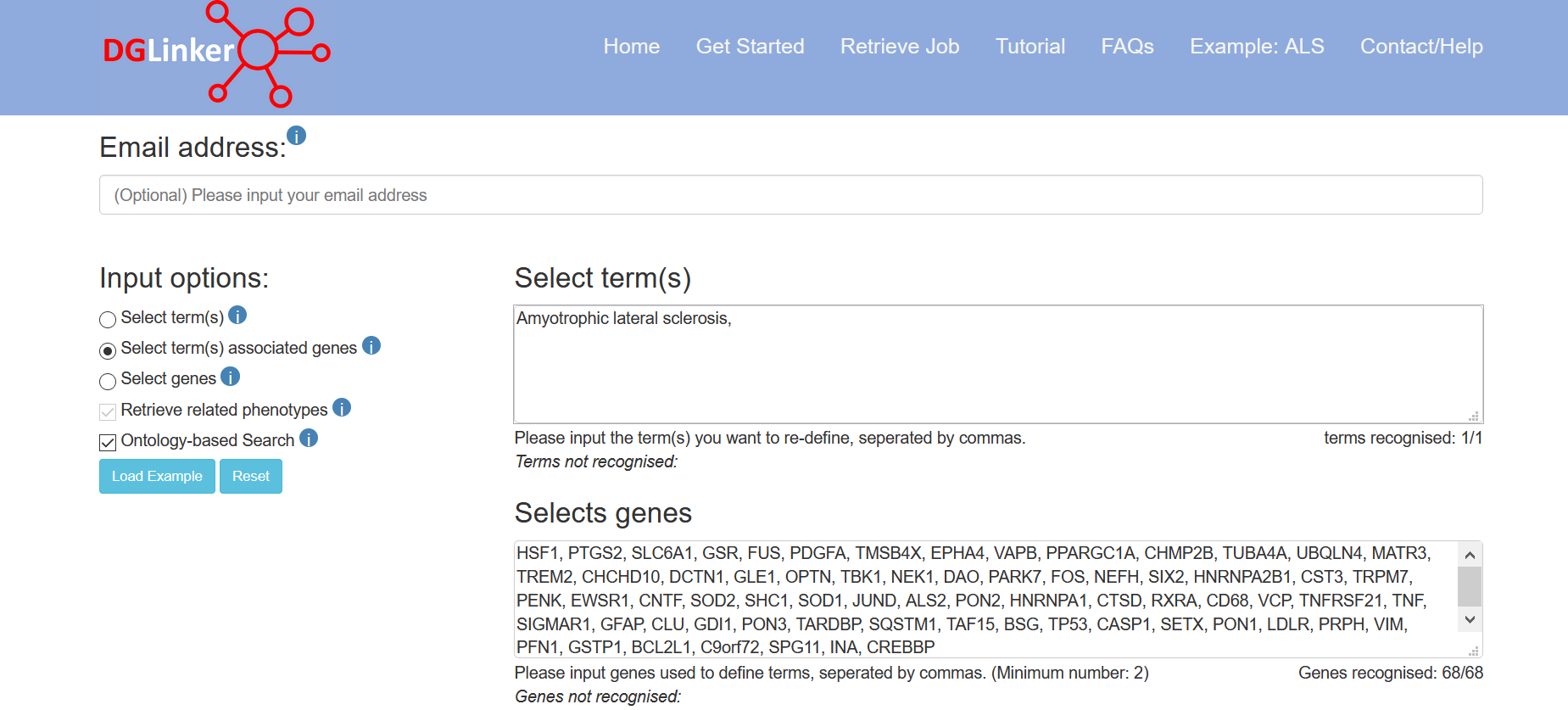
Figure 8
2.3 Available databases
By default, one gene-disease (DisGeNet), protein-protein interaction (IntAct) and the gene ontology (v2021-02) datasets are selected (Figure 9). The user can select additional databases or remove any of the default ones by ticking the corresponding boxes. At least one gene-disease database must be selected to start a job. The databases used in DGLinker will be updated every 3 months. Please note that the the Uniprot protein-protein interaction data available on DGLinker, consist of a subset or interactions from Intact with strong supporting evidence (https://www.uniprot.org/help/binary_interactions_import)
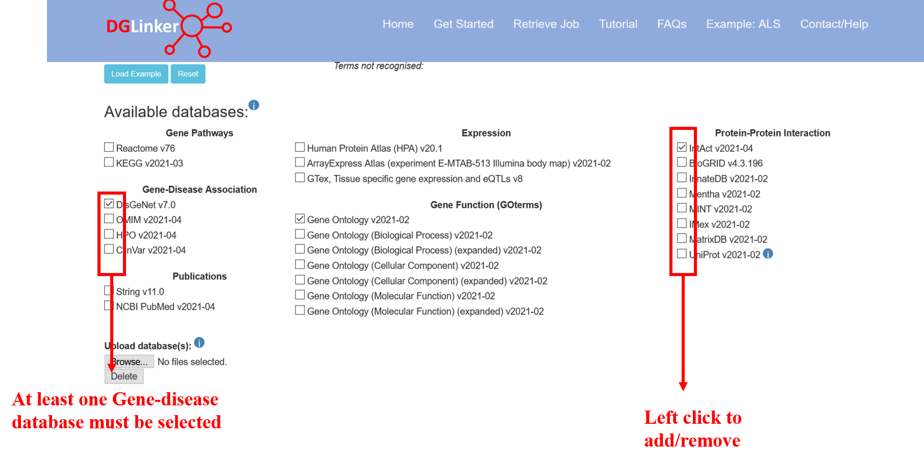
Figure 9
2.4 Upload database(s)
2.4.1 Upload database(s)
Users can upload their own dataset(s) of gene-phenotype or gene-gene relationships using the “Upload database(s)” tool (Figure 10a). If more than one database is to be uploaded, these must be selected and uploaded together (Figure 10b). Currently, there is a limit of 100Mb to upload datasets.
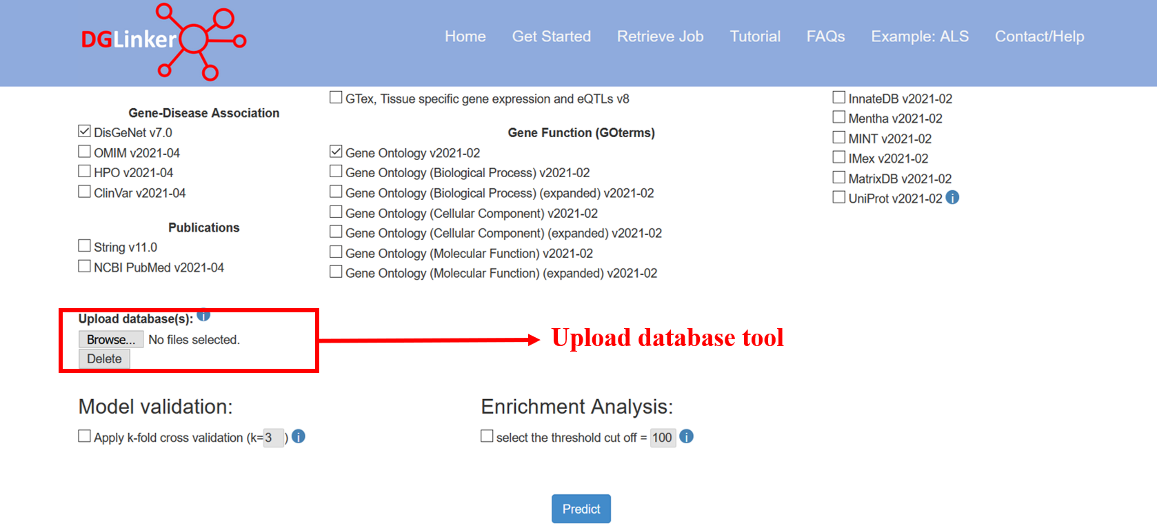
Figure 10a
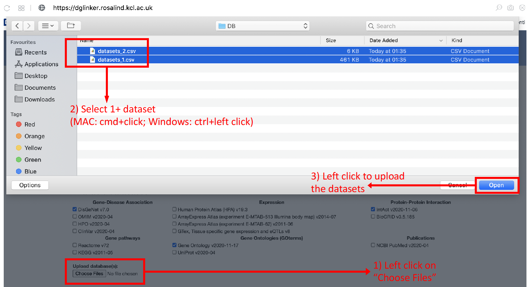
Figure 10b
2.4.2 Preparing input data
For each type of information you want to use, you need to:
1. Find a source database;
2. Download the data;
3. Convert the data to a comma delimited csv file with correct format:
All of the csv files uploaded to the algorithm have to look like this (Table 1). The source node type should always be ‘gene’ and there should be no header in csv files.
Table 1
| Source node name | Source node type | Relationship type | Target node type | Target node name |
|---|---|---|---|---|
| gene name: HGNC nomenclature (https://www.genenames.org) | gene | e.g. gene_disease_association (for Gene-Disease Association), protein_protein_interaction (for Protein-Protein Interaction) | The type which should not be gene | corresponding target name |
* Please note that only HCNG Approved symbols can be used.
2.5 Model Validation
The goal of the algorithm is to predict new genes linked to the input phenotypes based on facts about the genes known to be associated. In the cross-validation, this task is simulated by deleting a proportion of the known genes and training the algorithm on the remaining data before testing whether it can predict the link to the missing genes correctly. If the cross-validation is selected, DGLinker performs a standard k-fold cross validation protocol (where k is selected by the user but <= 5) using the input disease genes (Figure 11). Please notice that although the k-fold cross validation can be a useful tool to evaluate the model performance, it does increase the job processing time by approximately a factor k.
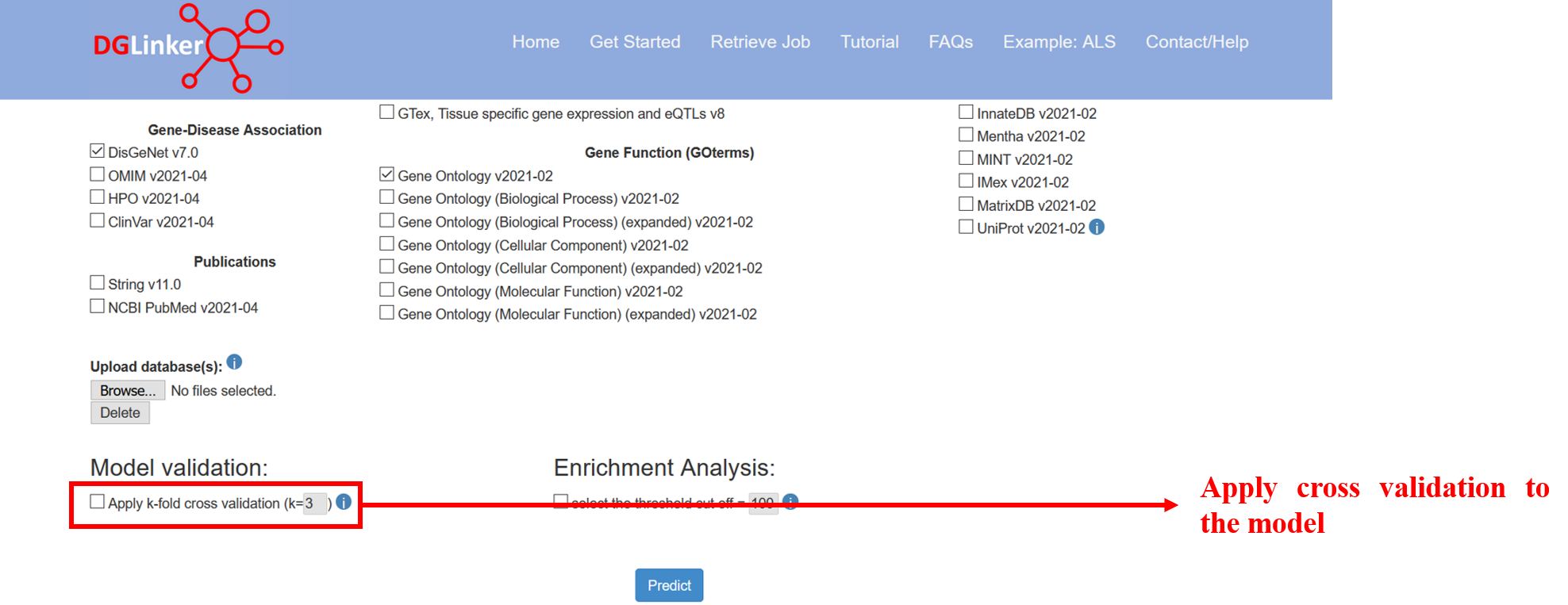
Figure 11
2.6 Enrichment Analysis
This option allow the user to select the threshold cut off for the number of predictions included in the enrichment analyses (Figure 12). DGLinker will automatically use top 100 new predicted genes if this option is not selected.
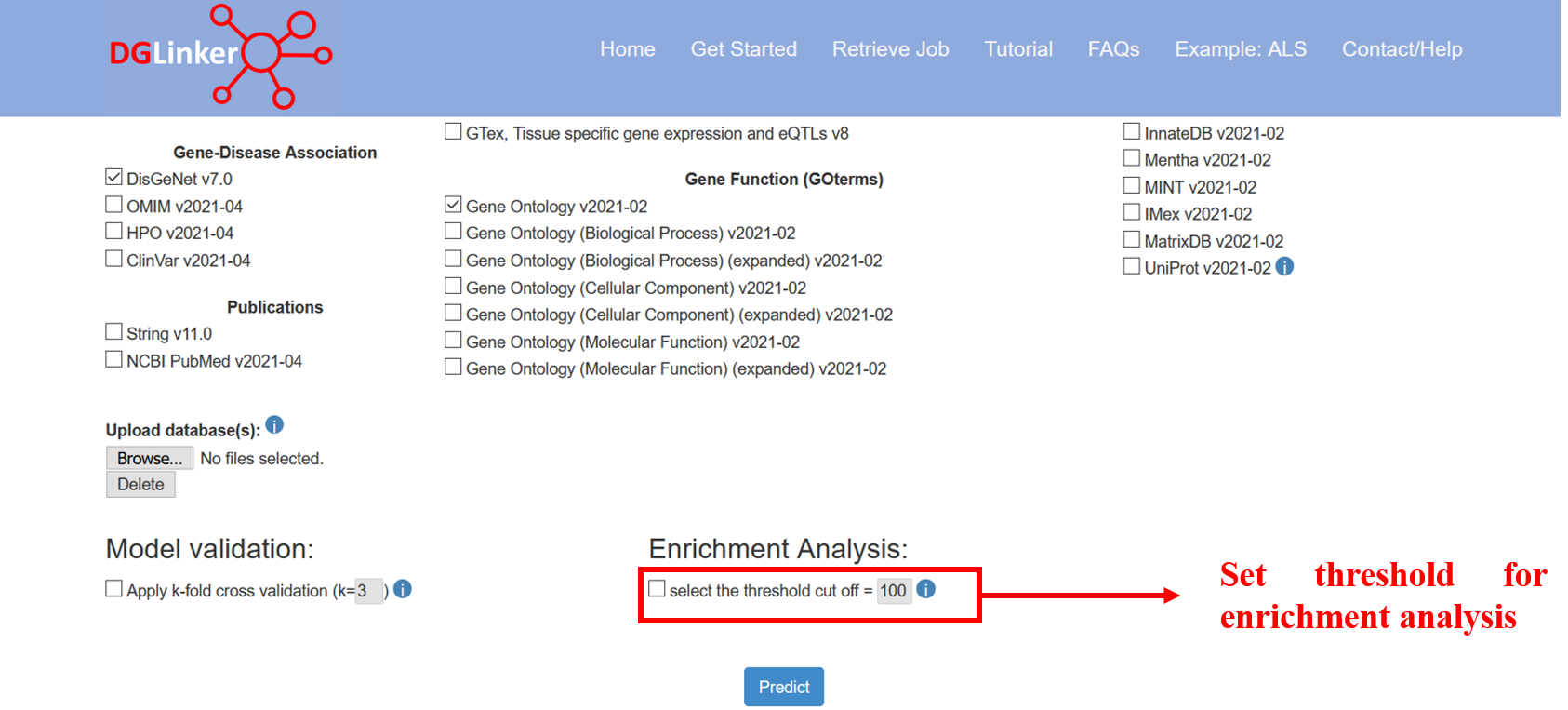
Figure 12
3. Retrieve a job
The user can retrieve their job results by using the job ID that was generated when the job was submitted (Figure 13). The Job ID is displayed in the waiting page after submission and emailed to the user if an email address was provided.
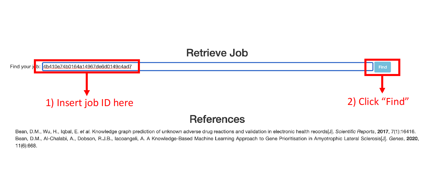
Figure 13
4. Results page
After submitting a job, results should be available within minutes.
However, this can vary substantially as the time needed to complete a job depends on the number
and size of the databases selected, and the number of input genes. Do not worry if the server takes
longer than expected. An error email is sent if the job fails as long as an email address was provided.
The results page is divided into the following 6 main tabs:
4.1 Job summary
This tab displays a table with the details of the job submission and predicted genes (Figure 14). Please note that the Number of input genes classified as disease-associated are the subset of the input genes that the model effectively classified as disease disease/phenotype associated give the assigned score and learned threshold. Please use the Results Table tab for a complete list.
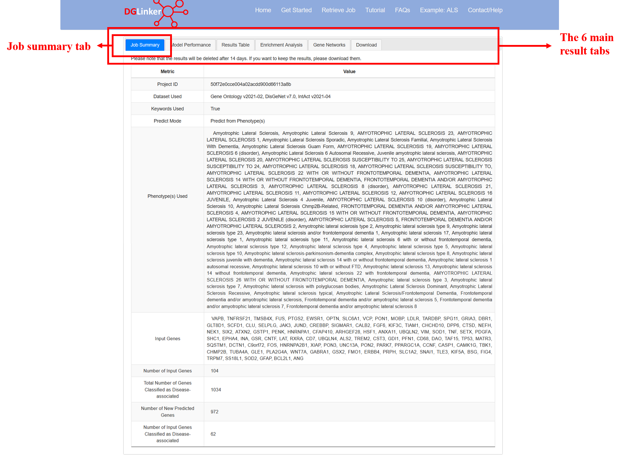
Figure 14
4.2 Model Performance
Standard performance metrics for a classification model are provided (Figure 15). These metrics are calculated on the entire dataset (i.e. not on a hold out set). When evaluating the performance of the model, please note that assessing the performance of disease-gene predictions presents several challenges. Due to our limited knowledge of the genetic landscape of most human diseases, complete sets of true positives and true negatives are generally not available. When new predictions are made by the model these are considered false-positives during training and so a model that makes new predictions cannot achieve a perfect score in most metrics, with the notable exception of recall. Please find below the description of the metrics that we report in the Model Performance tab:
- ACC = accuracy score = proportion of all genes in the knowledge graph that the model classified correctly as associated or non-associated.
- AUC = area under the receiver operator characteristic curve. A score of 0.5 is equivalent to random guessing, < 0.5 is worse than random guessing, and > 0.5 is better than random guessing. A perfect score is 1. Models with AUC =< 0.5 are discarded by the server.
- F1 = F1 score = harmonic mean of precision (proportion of predicted linked genes that are known linked genes) and recall (proportion of all known linked genes in the knowledge graph that were predicted). Given the nature of our problem, this metric is expected to be low. However, models with F1 substantially lower than 0.1 are difficult to use as this can translate in a very large number of predicted linked genes.
- J = youden’s J statistic = sensitivity + specificity – 1. Range 0 – 1 with a score of 0 meaning the model has no predictive value. The maximization of this metric is used by the model during training to identify the score threshold.
In the initial setup, the user can choose to also perform k-fold cross validation. If k=3 the known disease-linked genes are randomly divided into 3 groups and for each group the known disease-gene link for those genes is deleted from the knowledge graph before the model is trained. We can then determine whether a model trained on the rest of the data is able to predict those missing links we know should be there. This allows us to estimate the predictive performance of the trained model. However, given there are only so many genes to choose from, there is a chance of guessing these missing links at random. Therefore the model performance is compared to the probability of being correct by guessing.
If k-fold cross validation is performed, the following metrics are also provided:
- Total number of folds: the number of rounds of training (k) specified by the user.
- The number of folds that could be trained: out of k folds requested, how many resulted in a dataset that could be used to train a model. This is can be smaller than k when the number of known genes is small.
- The number of successful and significantly enriched folds: number of the folds where a model could be trained and did it do better than random guessing at predicting the hold out disease-gene links. This is based on a hypergeometric test.
- The average performance improvement vs random: the average of (model performance)/(expected performance of random guessing) over all successful folds. A score of 1 means no improvement on average.
On the right we show a pie chart of the relative contribution of each selected data type to the model. This represents the weights that the model learned to apply when calculating the score for each gene. In some cases the pie chart will be entirely one colour even if several databases were selected. This means the model ultimately did not use the other databases because they did not improve its performance. These weights are used to calculate the score for every gene, but because the known data about each gene varies (e.g. some genes may have no links in a certain database), the individual gene level pie charts in the results table can look different because the score for that gene was relatively more influenced by different data sources. The exception is for a database with weight zero, which cannot contribute to any score.
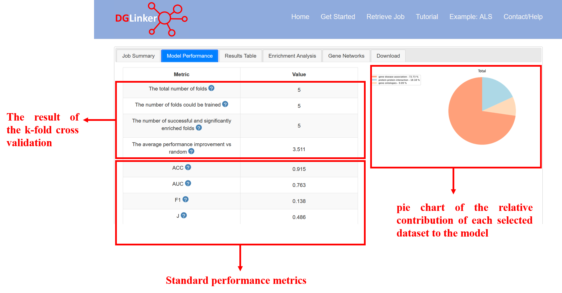
Figure 15
4.3 Results table
This tab displays an interactive table that contains the list of predicted and input genes, their prediction score, the pie charts showing the contribution of each type of databases to genes and a number of links to external databases that contain useful information about the genes (Figure 16).
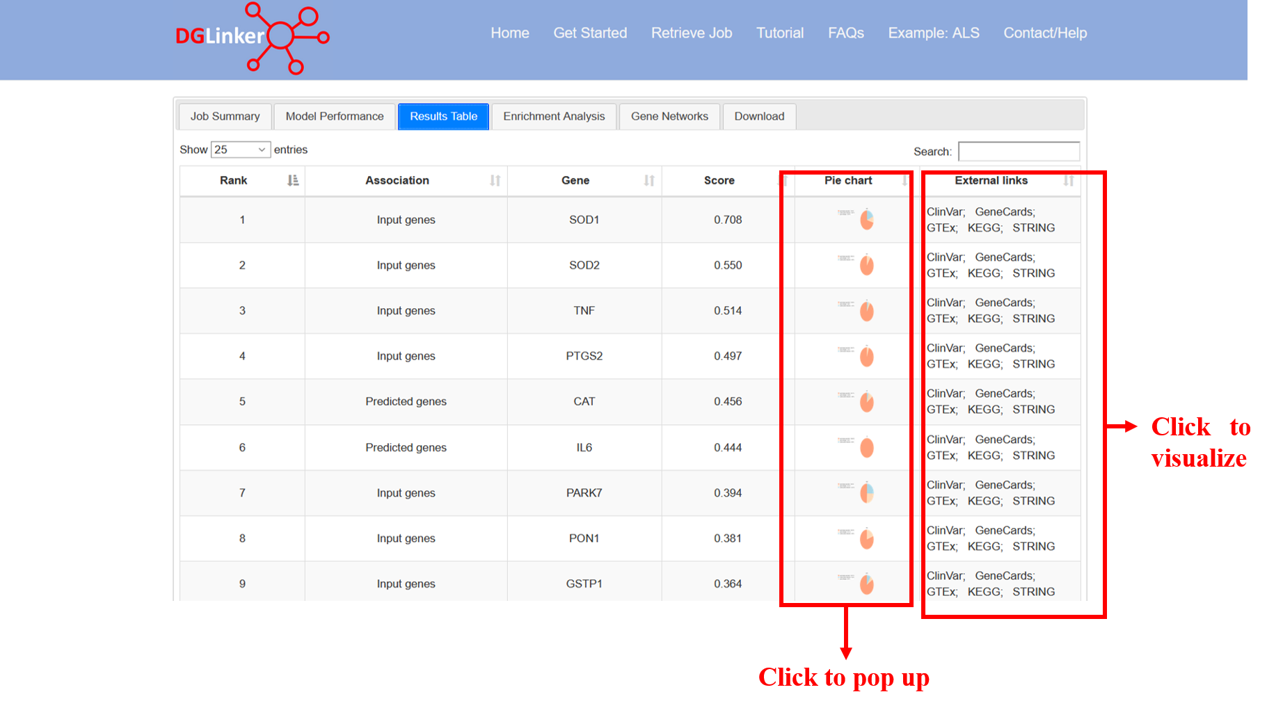
Figure 16
4.3.1 Pie charts
Although, the overall model contribution of each data type is summarized by the global pie chart in the Model performance tab (Figure 17), these individual gene pie charts show the contribution of each type of data to the disease-associated classification of each individual gene (Figure 18). As a result, the contribution of each data type to the individual genes can vary greatly. The CAT and SNCA genes from the ALS example (Figure 14) are a good example. From a model perspective, the direct interpretation of this difference is that the features that make CAT similar to the input genes are mostly related to what diseases CAT is associated with, while for SNCA, the similarity is mostly due to the proteins it interacts with. Of course, the biological interpretation of such results is not trivial, and it would require an in-depth analysis of the specific factors involved. The Network visualisation tool can favour this investigation as it displays the individual contributors of each gene, and their relationship with the known disease genes.
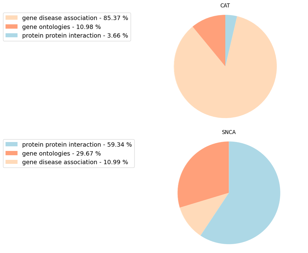
Figure 17
In some cases, the Model performance tab might show a full pie. A full pie can represent the following 2 scenarios: 1) the user selected only one type of data to build the model, e.g. only disease-gene databases; or 2) the predictive features selected by the machine learning belong only to one type of data (Figure 18). Both are common scenarios and should not alarm the user.
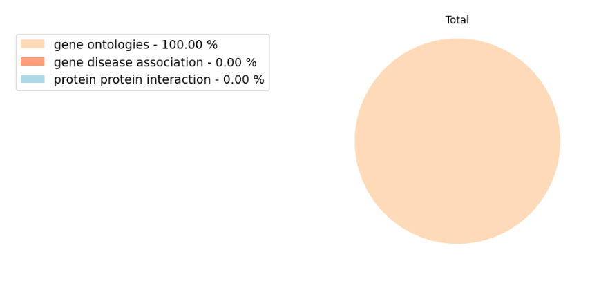
Figure 18
4.4 Enrichment analysis
This tab displays and allows the download of the results of the enrichment analysis. After the gene prediction step is completed, DGLinker performs a gene enrichment analysis using a hypergeometric test with FDR-BH correction in GOAtools (https://github.com/tanghaibao/goatools) with GO term counts propagated to parents, with 3 gene sets: the input genes, the top n predicted genes according to their score (n is a cutoff the user can select at submission, default is 100), and the union of these 2 sets (Figure 19).
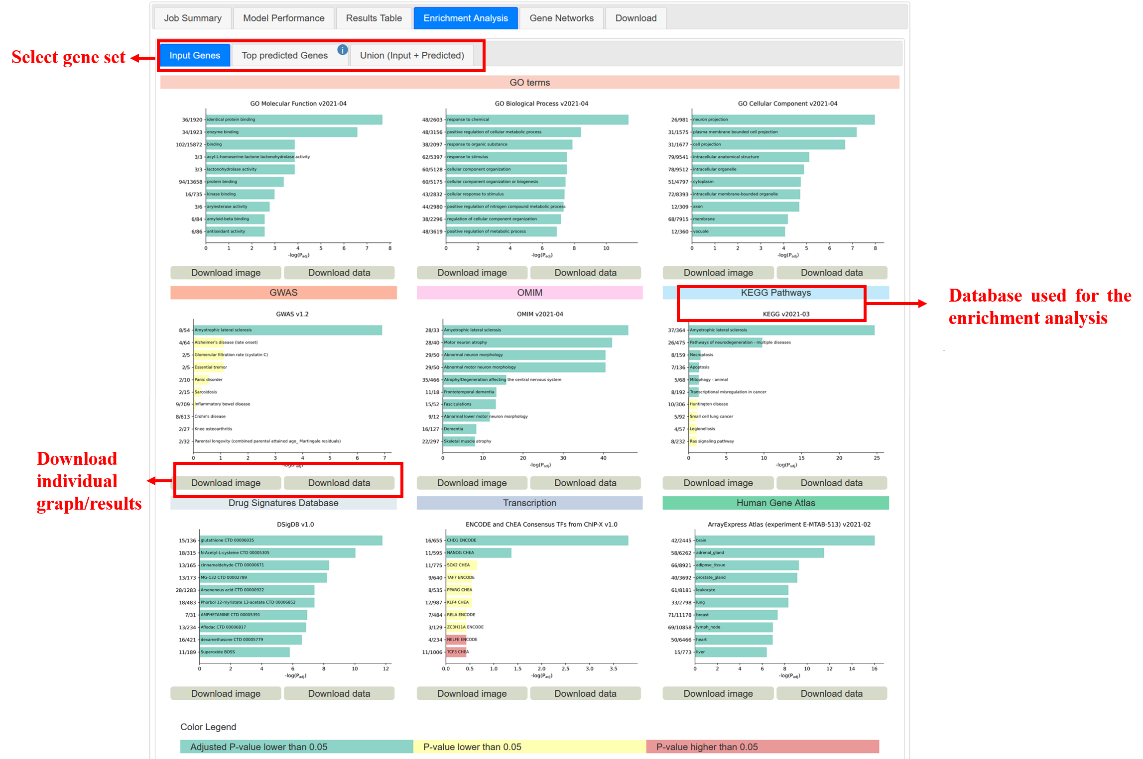
Figure 19
For each gene set, the graphs display the 10 most significantly enriched (according to the adjusted p-value) terms of the 9 databases. Both the graphs and the complete results of each individual gene set and database can be downloaded from this tab (Figure 19).
NOTE: The enrichment analysis can help researchers gain insight into the phenotype and biological processes underlying the results. This tab is designed to also allow for a direct comparison between the input genes and the predictions. It is important to highlight that, depending on the input options, some of the databases in this section might also be used to build the model which, if overlooked, might lead to a biased interpretation. For example, this can be the case for GO which is among both the default databases to build the knowledge-graph and the 9 databases in the enrichment analysis tab. However, given that GO is the world’s largest source of information on the functions of genes, we believe that its inclusion in the enrichment analysis on our web-server can be of great utility for many users as even in this scenario, it would still have value for the interpretation of the input gene set. Moreover, we also believe that added value is provided by the possibility to compare the results of the enrichment analysis on the input genes and on the predicted genes, which might highlight specific conserved functions. In conclusion, we recommend particular attention in using this resource when any of these 9 databases are selected to build the knowledge-graph and the model performance tab shows a contribution >0% to the predictions (see pie chart in figure 17, section 4.3 of the tutorial).
4.5 Gene networks
This tab allows to visualize the specific factors that contributed to the disease-gene classification of the top scoring 50 genes (Figure 20a). By clicking on the individual genes, an interactive network visualization is displayed in the right panel of the tab. This individual gene network will include all terms that contributed to the gene classification and all known disease genes that are linked to these terms.
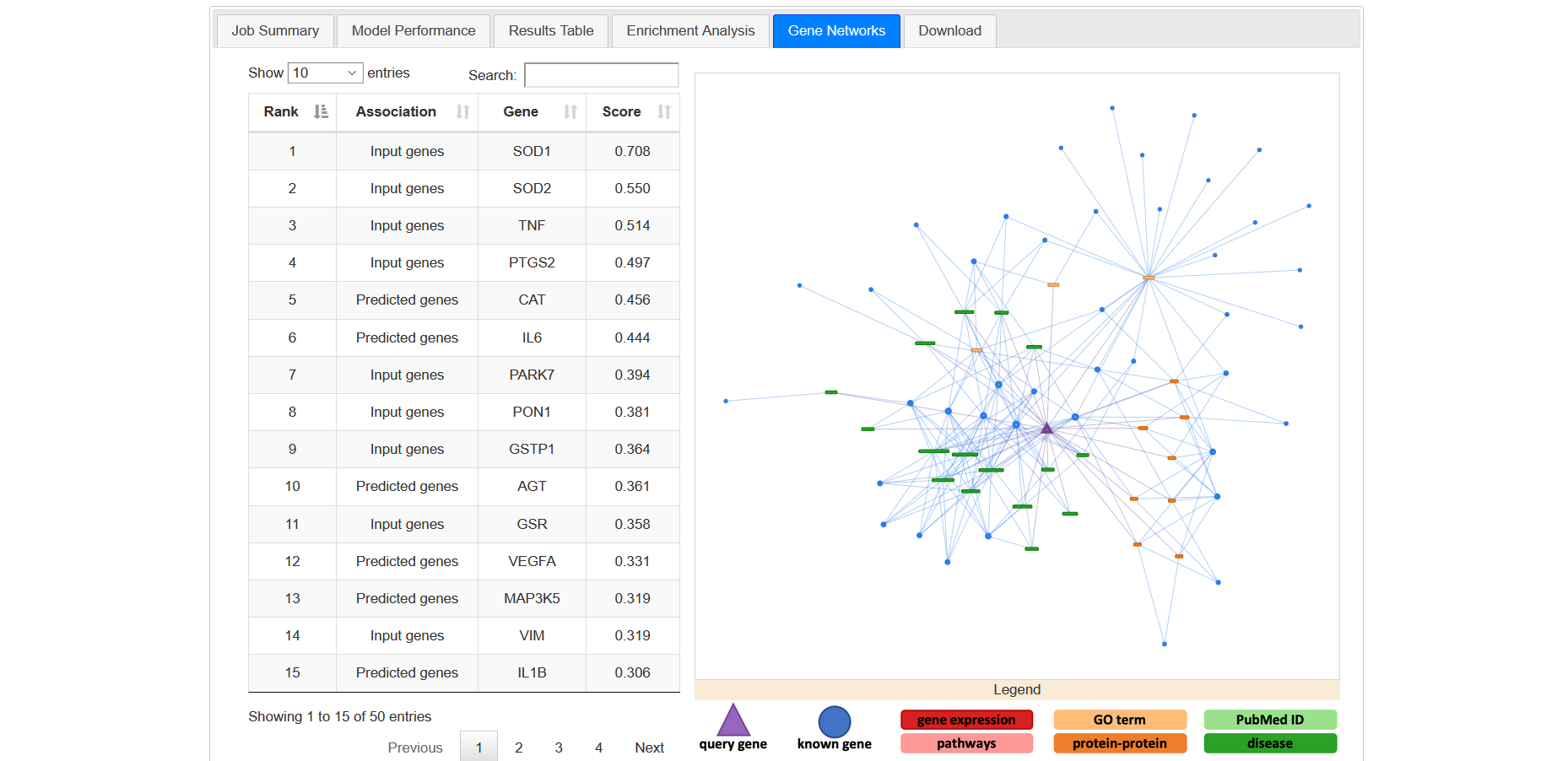
Figure 20a
You can see the interaction of each node with others by clicking on corresponding node (Figure 20b).
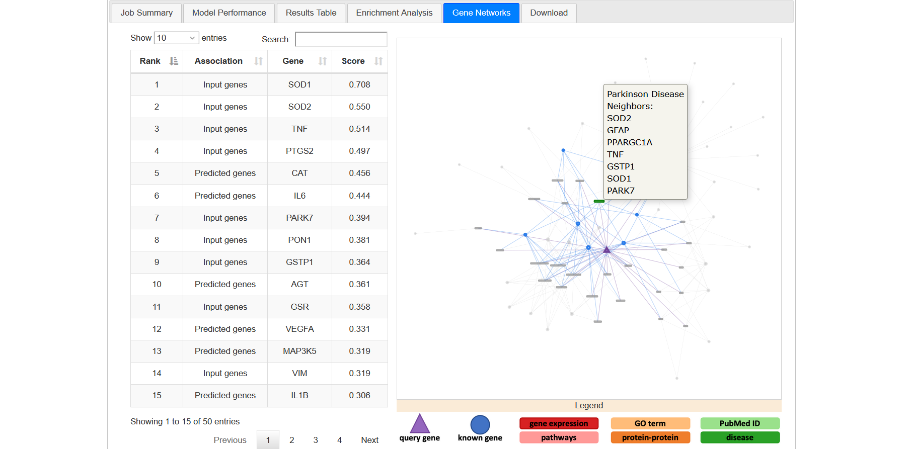
Figure 20b
In the network, the triangular node is the query gene. Circular nodes represent input genes and boxes represent non-gene nodes (e.g. GOterms). Different colours identify different classes of non-gene nodes (e.g. proteins, diseases, GOterms, etc). Below the network window, a legend describes the colour and shape scheme (Figure 20c).
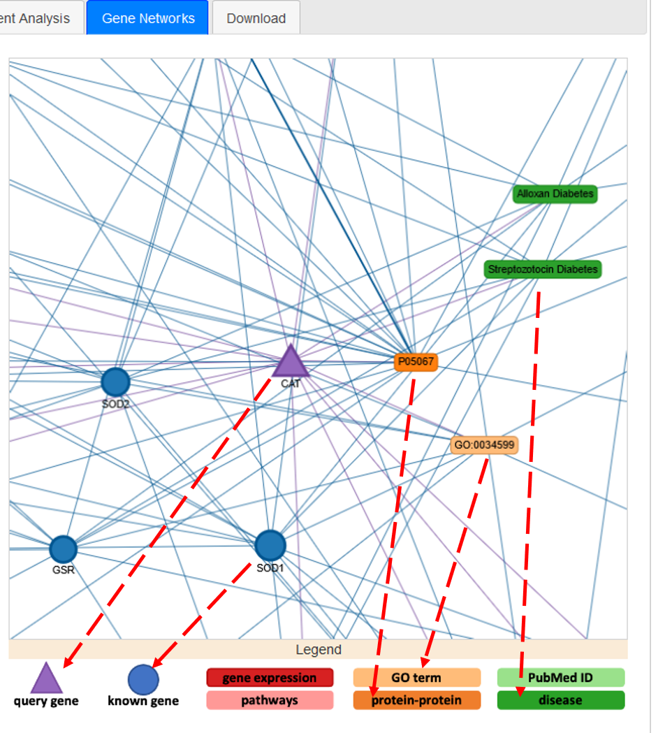
Figure 20c
4.6 Machine learning pipeline
- The machine learning pipeline is based on the method described in Knowledge graph prediction of unknown adverse drug reactions and validation in electronic health records(https://doi.org/10.1038/s41598-018-22521-4).
- The server uses the implementation in the edgeprediction library available in pip https://pypi.org/project/edgeprediction/
- The pipeline consists of four steps:
- Construct a knowledge graph from the selected databases;
- An enrichment test is then used to identify predictive features of the genes known to be associated with the target phenotype(s);
- Use these selected features to determine the adjacency matrix for all genes in the knowledge graph and the adjacency matrix is then scaled and weighted to produce a final score for every gene;
- Optimum weighting and score threshold are learned from the known set of associated genes to maximise J (youden’s J statistic).
4.7 Download results
This tab allows the user to download the whole set of results as a zip archive (Figure 21).
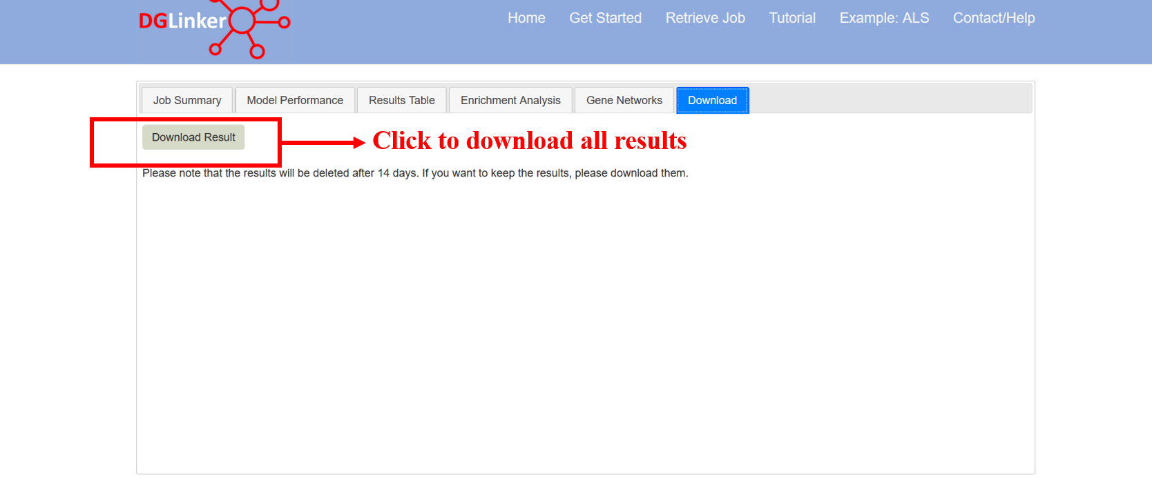
Figure 21
5. Results files
All results can be downloaded from the webserver as a zip archive named “zip$jobID.zip”. By double-clicking on the zip archive, you should be able to extract its content as most operative systems have compression utilities to deal with zip files preinstalled (Figure 21). However, in the event that you do not have such utilities preinstalled, you can download one from the web (e.g WinRar https://www.win-rar.com). Please find below a description of the content of the results zip archive.
zip$jobID
|-enrichment$jobID #This folder contains the results of the gene enrichment analysis
| |-$jobID_$geneSet_$db.txt #raw results of the gene-set analysis
| |-$jobID_$geneSet_$db.png #graph of the top 100 hits from the gene-set analysis
|
|-graph_dir$jobID #This folder contains the interaction networks of all genes
| |-$geneName.txt #individual gene interaction file in text format
| |-graph_$geneName.html #"standalone" individual gene network in html format
|
|-pie_chart_$jobID #This folder contains the pie charts showing the contribution of each type of databases for all genes
| |-$geneName.png #contribution of databases to individual genes in png format
|
|-results_genomic_regions_$jobID
| |-$geneSet_$db.bed #The BED (Browser Extensible Data) file, used to store genomic regions as coordinates and associated annotations
|
|-model_results
|-graph_file$jobID.txt #network interaction file in text format of the knowledge-graph
|-job_summary_$jobID.txt #job summary file
|-results_$jobID.txt #model output: gene list and scores
|-model_performance_$jobID.txt #model performance: the result of the k-fold cross validation and the performance of the model
6. Browser compatibility
DGLinker was tested on the browsers listed in Table 2.
| OS | Version | Chrome | Firefox | Microsoft Edge | Opera | Safari |
|---|---|---|---|---|---|---|
| Linux | Ubuntu 16 | 71.0.3578.98 | 67.0.4 | n/a | 73.0.3856.284 | n/a |
| MacOs | Catalina 10.15.5 | 87.0.4280.88 | 82.0.2 | n/a | 73.0.3856.284 | 13.1.1 |
| Windows | 10 | 78.0.3904.108 | 71.0 | 44.18362.449.0 | 73.0.3856.284 | n/a |
7. External resources
| DGLinker usage | Source name | Link | Reference |
|---|---|---|---|
| Knowledge graph and Machine Learning method | ADR-graph | Github(https://github.com/KHP-Informatics/ADR-graph) | Bean at al.[1] |
| Gene Ontology (GO) terms | GOAtools | GOAtools(https://github.com/tanghaibao/goatools) | Tang et al. [2] |
| Network visualization | Pyvis | Pyvis website(https://pyvis.readthedocs.io) | Perrone et al. [3] |
| Bio/Pheno Databases | EBI- PSICQUIC | EBI website(http://www.ebi.ac.uk/Tools/webservices/psicquic/view/main.xhtml) | Del-Toro et al. [4] |
8. References
[1] Bean, Daniel M., et al. "Knowledge graph prediction of unknown adverse drug reactions and validation in electronic health records." Scientific reports 7.1 (2017): 1-11.
[2] Klopfenstein, D.V., et al. "GOATOOLS: A Python library for Gene Ontology analyses." Scientific Report 8 (2018): 10872.
[3] Perrone, Giancarlo, Jose Unpingco, and Haw-minn Lu. "Network visualizations with Pyvis and VisJS." arXiv preprint arXiv:2006.04951 (2020).
[4] del-Toro, Noemi, et al. "A new reference implementation of the PSICQUIC web service." Nucleic acids research 41.W1 (2013): W601-W606.
9. Extras
9.1 Using results from sequencing studies in DGLinker
The results from sequencing studies can be easily adapted to be utilised in DGLinker both as input genes and as additional data to build the model. In any case, such results need to be provided as gene lists or gene interaction databases and therefore a few steps might be needed to format them appropriately. In the following sections we present a few common scenarios.
9.1.1 As input genes
9.1.1.1 Your results are a set of genes
If your results are a set of genes associated with a human disease or health related phenotype (e.g. fever, headache) please search your target phenotype in the DGLinker database and provide the gene list using the Select phenotype(s) associated genes input option. If no query term is recognized by the server, please use the Select genes input option to provide the list of genes without specifying any target phenotype. Please note that the HGNC gene symbols must be used.
9.1.1.2 Your results are a set of variants
If your results are a set of variants, these need to be mapped onto genes before being usable on DGLinker. This can be done in several ways. An easy one is to use VEP (https://www.ensembl.org/Tools/VEP). This webservice will allow you to upload your list of variants (Figure 22) and annotate them with a wide range of information, including which genes they map to, with a simple click. The annotate variants can be downloaded as a tab-delimited text file for use in spread-sheet software, e.g. Excel, from which the gene symbol column can be easily extracted to make your gene list (Figure 23). With this gene list, please follow the instructions in section 9.1.1.1 above.
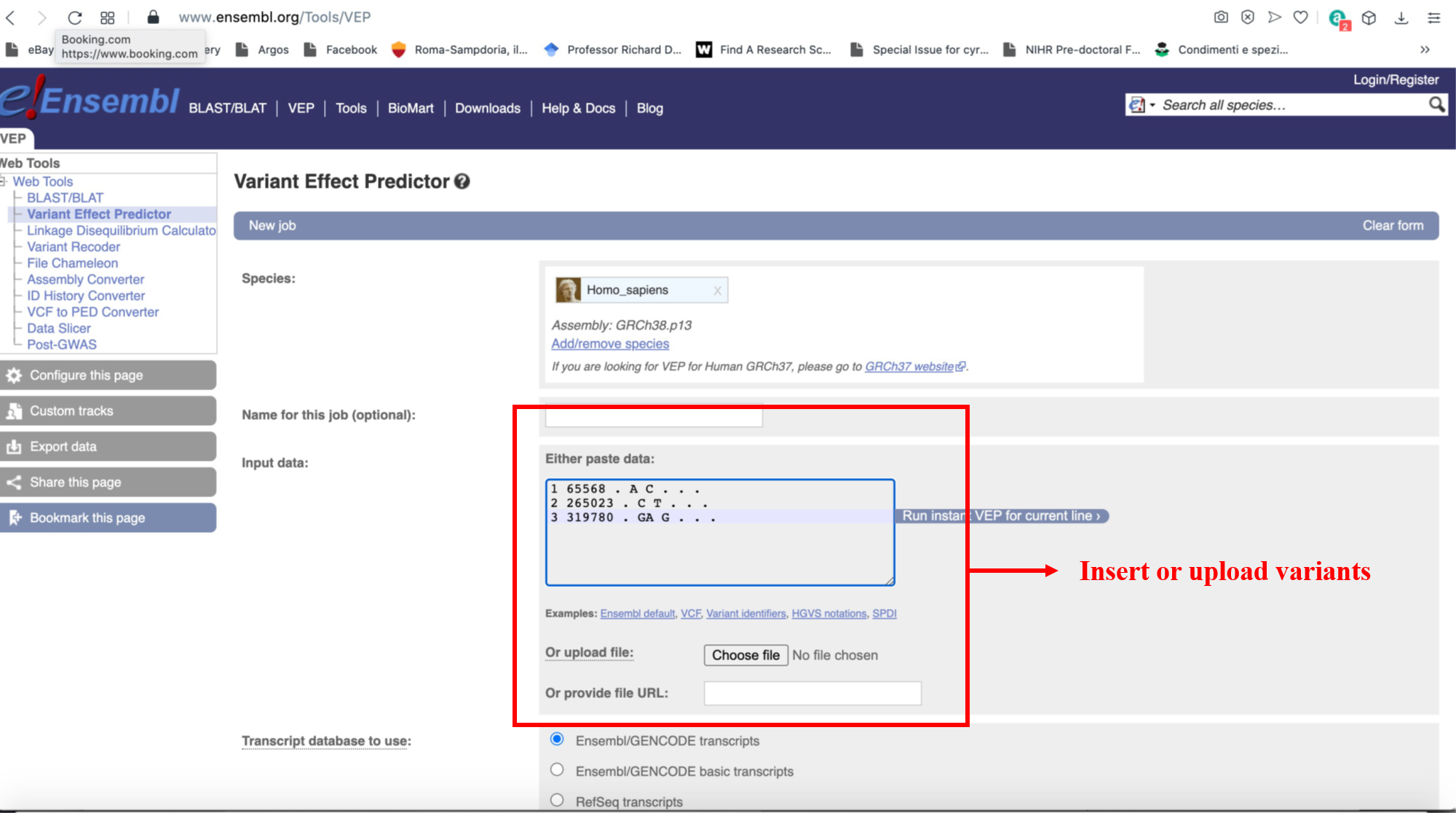
Figure 22
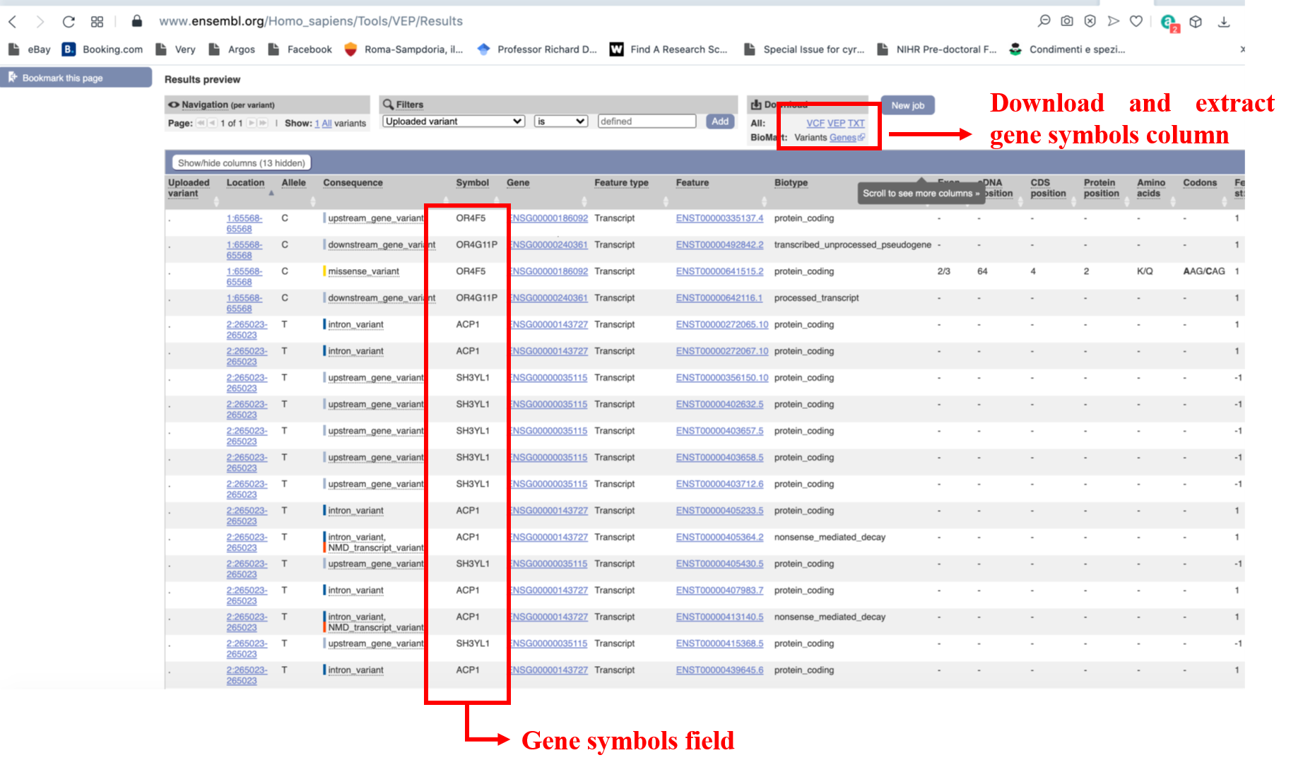
Figure 23
9.1.2 As additional database
In order to use your results as databases to build the model, these need to be adapted to the format described in section 2.5.2 above. Please make sure that your gene lists follow the HGNC nomenclature. If your results are genetic variants, please map them onto genes first. You can do this by, for example, following the instructions in section 9.1.1.2 above.
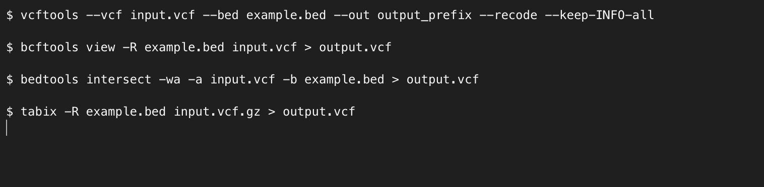
9.2 Using the DGLinker output for variant filtering
DGLinker generates region files in BED format (https://en.wikipedia.org/wiki/BED_(file_format)) for the input predicted genes. These can be found in the results_genomic_regions_jobID folder of the downloadable results archive. Both hg19 and hg38 coordinates can be found (chr prefixes are used).
These files can be used to filter variants from sequencing experiments in several ways using a number of bioinformatics tools. For example, for variants in
VCF format (https://it.wikipedia.org/wiki/Variant_Call_Format) please find below examples of command lines for some widely used tools:
Alternatively, they can be used as custom tracks on genome browsers such as UCSC (https://genome.ucsc.edu) and ENSEMBL (https://www.ensembl.org/index.html). For documentation about how to use the bed files as custom tracks please see the following links: